Css Creat Animation
CSS3でローディングバーを制作する1
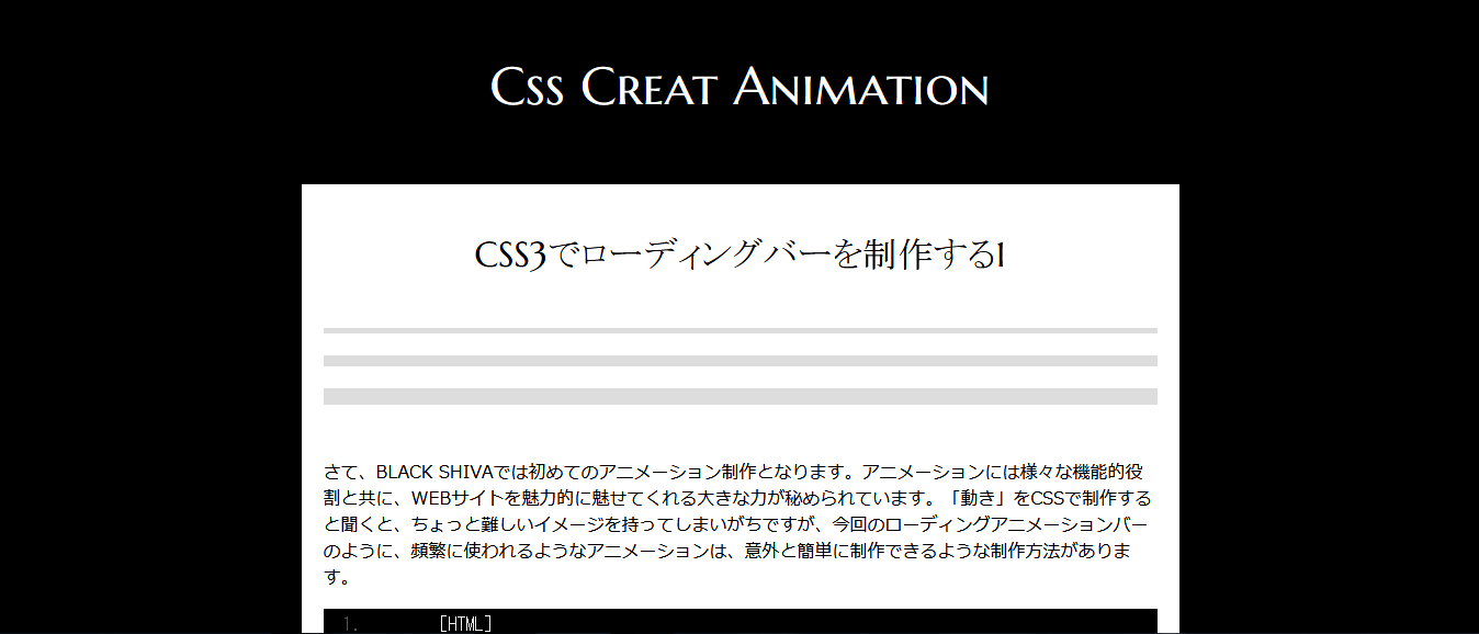
	[HTML]
    <div id="bar">
	<div class="loading-bar"></div>
	<div class="loading-bar2"></div>
	<div class="loading-bar3"></div>
	</div>
上記サンプルには3パターンのローディングが表示されています。お気づきになった方も多いと思いますが、3パターンのどれもが太さ、バーに色が走る早さに違いが出ています。まずは一番上に表示されている、ピンクのローディングバーを基本として、説明します。HTMLを上記のように用意してください。
ローディングの基本的全体像は<div class="loading-bar"></div>にて制作していきます。
[CSS3]
 #bar{
    margin: 50px 0;
	}

 .loading-bar {
  background: #ccc;
  height: 5px;
  position: relative;
  margin-bottom: 20px;
}

.loading-bar::before {
  -webkit-animation: width-0to100 1s infinite ease-out;
  -moz-animation: width-0to100 1s infinite ease-out;
  -o-animation: width-0to100 1s infinite ease-out;
  -ms-animation: width-0to100 1s infinite ease-out;
  animation: width-0to100 1s infinite ease-out;
  background: #ff555f;
  content: '';
  height: 5px;
  left: 0;
  position: absolute;
  top: 0;
}
上記CSS3が基本的なローディングの形となります。上記と同じCSS3をご用意ください。今はまだローディングバーが動かず、バックグラウンドの灰色だけが下記のような状態になっているはずです。
 ではここから細かく解説していきます。
[CSS3]

 .loading-bar {
  background: #ccc; /* 大元のバックグラウンド背景色 */
  height: 5px; /*ローディングバーの太さ*/
  position: relative;
  margin-bottom: 20px;
}

/* before疑似要素を設定することによって、上記背景の上に違う色のロールバーを走らせる */
.loading-bar::before {
  -webkit-animation: width-0to100 1s infinite ease-out;
  /*width-0to100→横幅0から100までをローディングバーが走る、1sは速さ*/
  -moz-animation: width-0to100 1s infinite ease-out;
   /*infiniteは無限に再生を繰り返す ease-outは最初は高速で走り、最後はアニメーションが減速します。*/
  -o-animation: width-0to100 1s infinite ease-out;
  -ms-animation: width-0to100 1s infinite ease-out;
  animation: width-0to100 1s infinite ease-out;
  background: #ff555f;/*走るローディングバーの色指定*/
  content: '';
  height: 5px;/*走るローディングバーの太さ*/
  left: 0;
  position: absolute;
  top: 0;
}
まずは一番上にあるロールバー3本の違いは、before疑似要素部分にて違いが大きく変わっていることがわかります。唯一共通して変更がかかっているのは「棒の太さ」ですね。大元のバックグラウンドになっている、.loading-barの中に、height: 5px; /*ローディングバーの太さ*/というものがあります。
まずはここで自分好みの太さを設定、次に必ず同時設定しなければならないのは.loading-bar::beforeの中にある、height: 5px;/*走るローディングバーの太さ*/です。ここを忘れてしまうと、大元の背景とは太さの違うバーが走ってしまうことになります。(場合によってはデザイン的にそれも面白いかもしれません。)
疑似要素ではローディングバーがどこからどこまで、どのような速さで、どのようなアニメーションの動きをするのか?という内容を設定しています。 *width-0to100→横幅0から100までをローディングバーが走り、早さは一番早い1s,(2s,3sと数字が大きくなるにつれてスピードは遅くなります。)、動きはease-out、最初は高速で走り、最後はアニメーションが減速します。ここまで設定内容が理解できたところで、早速動かしてみましょう! 下記css3を追記してください。
[CSS3]

 @keyframes width-0to100 {
  0% {
    width: 0;
  }


  100% {
    width: 100%;
  }

}
上記記述は本当にもうそのままの解釈です。横幅0から100までカラーローディングバーを走らせます。
【1,爽やかなブルーグラデーションローディングアニメーションバー】
[HTML]
<div id="bar">
	<div class="loading-bar4"></div>
	</div>
[CSS3]
.loading-bar4 {
  background: #000;
  height: 30px;
  position: relative;
  margin-bottom: 20px;
  border-radius: 30px;
}

.loading-bar4::before {
  -webkit-animation: width-0to100 3s infinite ease-out;
  -moz-animation: width-0to100 3s infinite ease-out;
  -o-animation: width-0to100 3s infinite ease-out;
  -ms-animation: width-0to100 3s infinite ease-out;
  animation: width-0to100 3s infinite ease-out;
  border-radius: 30px;
  background: linear-gradient(#05FBFF, #1E00FF);
  content: '';
  height: 30px;
  left: 0;
  position: absolute;
  top: 0;
}

@keyframes width-0to100 {
  0% {
    width: 0;
  }


  100% {
    width: 100%;
  }

}
【2,クールなアニメーションインジケーター】
[HTML]
<div id="bar">
	<div class="loading-bar5"></div>
	</div>
[CSS3]
.loading-bar5 {
  background: #000;
  height: 5px;
  position: relative;
  margin-bottom: 20px;
  border-radius: 30px;
}

.loading-bar5::before {
  -webkit-animation: width-0to100 3s infinite ease-out;
  -moz-animation: width-0to100 3s infinite ease-out;
  -o-animation: width-0to100 3s infinite ease-out;
  -ms-animation: width-0to100 3s infinite ease-out;
  animation: width-0to100 3s infinite ease-out;
  border-radius: 30px;
  background: linear-gradient(#5f5f5f, #f4f4f4);
  content: '';
  height: 5px;
  left: 0;
  position: absolute;
  top: 0;
}

@keyframes width-0to100 {
  0% {
    width: 0;
  }


  100% {
    width: 100%;
  }

}